On the current jerseys of L.R. Vicenza Virtus, the main football or calcio professional team of the city of Vicenza, as well as in its new official logo, it is easily identifiable a big “R”. But what does it stand for?
The great “R” and the letters L.R. are a reminder and a tribute to the Lanificio Rossi of Schio (later just “Lanerossi”). The company, founded in 1817 in the town of Schio – VI, became the largest Italian textile industry of the twentieth century.
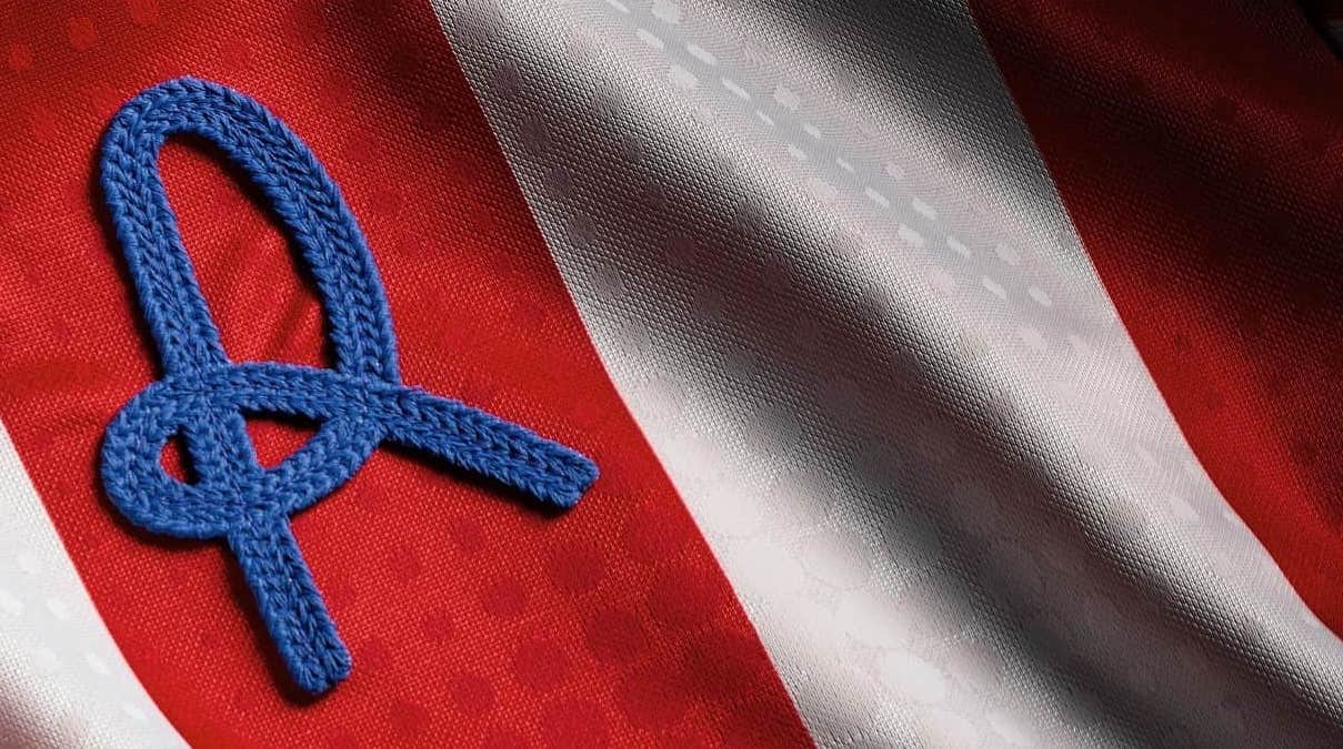
In June 1953, Lanerossi acquired the Vicenza football club, effectively transforming it into his own company division. Since then and until 1990 the team was called “Lanerossi Vicenza”, always wearing on the shirt the characteristic “R”, logo of the textile company. The letter was made by a single rolled and sewn fabric tape. That explains its peculiar shape.
-
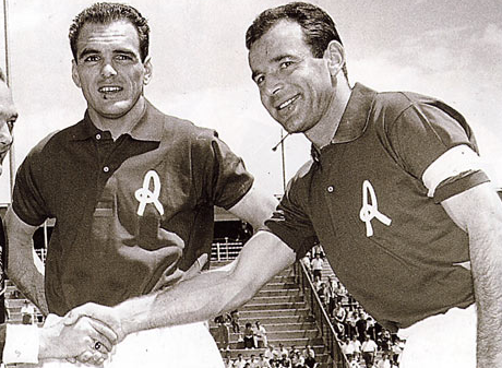
- Luís Vinício and Giulio Savoini, great players of the Lanerossi in the twenty years of Serie A (1955-1975)
-

- The current logo of the L.R. Vicenza Virtus Football Club
In July 2018, after the club’s acquisition by Renzo Rosso (founder of DIESEL, a global clothing company based in Breganze – VI), Lanerossi’s R became once again the cornerstone of the club’s symbolism.
Personally, we’re crazy about that “R”. GO LANE!